
Shopping Cart
FTDNA
Cart and Checkout Redesign

Overview
FamilyTreeDNA was the first company to introduce direct-to-consumer DNA testing, launching its services in the year 2000. The company served a broad range of consumers, with a focus on genetic genealogy, helping people uncover their ancestry and relationships through DNA analysis.
However, despite its innovative services, the process of purchasing DNA testing was difficult for users due to several factors such as the absence of clear feedback, limited product information, a complex checkout process, loading issues, restricted payment options, and a lack of mobile compatibility.
THE TEAM
Chris P - Product Manager
Meagan P - Product Owner
Doug K - Engineering Lead
David N - Bussines Analyst
Jon M. Quality Assurance Lead (QA)
MY ROLE
User research, Wireframing, Interface Design, User Testing. and Front-End support
TOOLS USED
Contentsquare, Google Analytics, Adobe XD, Google Forms, AngularJS, GitHub, HTML5 and SCSS.
🔍 Exploring The Problem
Stakeholder interviews
To gain a better understanding of the issues reported by users, I conducted stakeholder interviews with the Customer Service Department, Business Analyst, and Marketing Director.
Key Findings
Users were experiencing timeouts and unexpected errors while trying to place an order.
The predominantly grey and white color scheme made it challenging for users to read the content, which resulted in frustration and confusion.
The cart was in a pop-up format, causing difficulties for users on mobile devices and those with pop-up blockers.
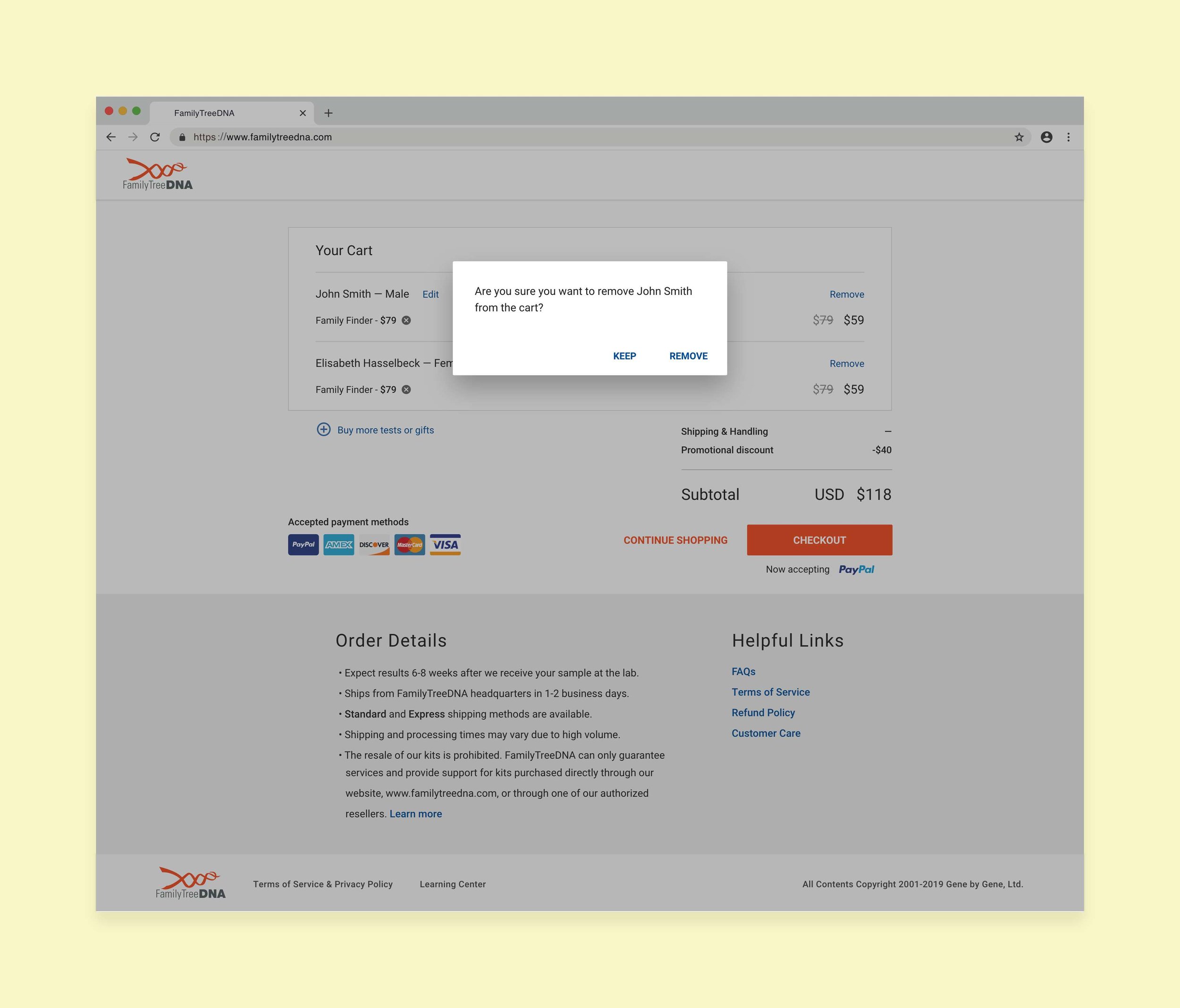
A high number of refunds, approximately 100 per month, due to duplicate orders caused by errors in the cart during the ordering process.
Heuristic evaluation
To gain further insights into the usability issues of the shopping cart experience, I conducted a heuristic evaluation by capturing screenshots of various user journeys and analyzing them for common problems.
Key Findings
The design was overcrowded and made it challenging for users to concentrate on essential information.
There was a lack of adequate color contrast in crucial parts of the shopping experience, which made it difficult for users to read and understand the information.
Error messages during the checkout process were not clear, causing confusion and frustration for users.
The shopping cart was not optimized for mobile devices, resulting in a subpar user experience for users who accessed the website on their smartphones or tablets.

What FamilyTreeDNA’s cart used to look like on Desktop and Mobile
Behavioral metrics
To gain a deeper understanding of user behavior and the reasons behind customers' struggles, I utilized the Contentsquare analytics platform to gather additional data.
User buying DNA kit from a mobile device.
User types
After conducting extensive user research and analyzing the gathered data, the Product Manager and I identified two main user flows for the shopping cart experience:
Case A - New User
Purchasing one kit with a single product.
Purchasing one kit with more than 1 product.
Purchasing more than one kit with a single product for each.
Purchasing more than one kit with more than 1 product for each.
Case B - Existing FamilyTreeDNA user
Purchasing a single product for a logged-in user.
Purchasing more than 1 product for logged-in users.
Purchasing a single product for logged-in users and a new kit containing a single product.
Purchasing more than one product for logged in user and a new kit containing more than 1 product
📝 Iterating on solutions
I started by creating the information architecture on paper for the previously mentioned primary use cases. After agreement from the Product Manager, developers, and stakeholders, I created a prototype using components from our Design System to conduct user testing.
The participants were between 26 and 65 years old, and the usability tests were conducted in person. They were given three scenarios, each with a specific task.
Scenario 1: Buy a DNA kit for you and someone else
Scenario 2: Buy an upgrade for the existing user and a DNA kit gift to someone else.
Scenario 3: Buy an upgrade for the existing user and an extra DNA kit gift with more than one product.
Participants completed all tasks; however, it took some time for some users to add another kit (gift) to someone else. I did one iteration of the designs and validated my solutions with the remaining users.
🎨Final UI Design
Intuitive add to cart screen
Users previously faced difficulties selecting a DNA test, as all options had equal importance. This often resulted in existing users creating multiple accounts. The updated process now asks users if the test is for a new or existing user, streamlining the selection process.


Kit setup and cart view enhancements
To simplify and speed up the process, I separated the kit setup steps from the Cart view and listed each tester's name with their respective DNA test.


3 steps checkout
To mitigate the risk of refunds caused by errors such as duplicate orders, gender selection mistakes, and multiple accounts created by a single user, a three-step checkout process was implemented. This process also enables us to collect customer data at the start, even if they don't complete the checkout.
The aim was to make the shipping, billing, and order review process less overwhelming by dividing it into separate steps. This also allows us to track user behavior better using analytics tools such as Google Analytics and Contentsquare.


🚧 A bump in the road
Unfortunately, the project had to be put on hold due to unexpected challenges until further notice. This was primarily because of the lack of resources and other projects that had taken priority. However, based on previous research and analysis of the current shopping cart, I spoke with the dev lead to come up with a new plan to move forward.
Several proposed features had to be compromised on, but we were able to make some key improvements that would address user needs while also aligning with business goals.
Removed the cart experience from the modal (dialog box).
Made the cart experience mobile user-friendly.
Included Angular Material to enhance accessibility, design consistency, reusability, and flexibility.
Included PayPal as a payment option to provide users with more flexibility in how they choose to pay.


📊 Success metrics after release
The new design cart experience was released in the last quarter of 2020, and it's been successfully accepted.
We found that:
Customer service stopped receiving complaints about duplicate orders.
60% of users stopped contacting customer service for help purchasing a DNA test.
Mobile conversion rates increased by 30%.
The payment process is almost 3x faster.